Neutral interiors are everywhere right now.
But many homeowners designing a 1 BHK flat get confused between:
- warm beige interiors
- soft greys
- creamy whites
- cooler modern palettes
Social media makes the confusion even bigger because one apartment looks warm and cozy, while another looks sharp and ultra-modern.
And in compact homes, colour undertones matter more than people realize.
The wrong neutral palette can make a small flat feel:
- darker
- colder
- visually cramped
- disconnected
While the right palette can make the same apartment feel:
- brighter
- calmer
- more spacious
- easier to live in daily
The good news is that both warm neutrals and cool neutrals can work beautifully in a 1 BHK.
The better choice usually depends on:
- natural light
- furniture style
- flooring tones
- lighting temperature
- the emotional atmosphere you want at home
Because honestly, neutral colours are never boring when textures, lighting, and layering are handled properly.
What Are Warm Neutrals and Cool Neutrals?
Before choosing colours, it’s important to understand undertones properly.
What Are Warm Neutral Colours?
Warm neutral interiors usually include:
- beige
- cream
- warm whites
- greige
- sand tones
- earthy taupe shades
These colours have:
- yellow undertones
- earthy softness
- warmer visual depth
Warm neutrals create:
- coziness
- comfort
- softness
- relaxed atmosphere
That’s why beige apartment colours often feel more welcoming emotionally.
What Are Cool Neutral Colours?
Cool neutral interiors include:
- cool greys
- ash whites
- blue-grey shades
- crisp whites
These colours have:
- blue undertones
- grey undertones
- sharper visual appearance
Cool grey apartment colours usually create:
- cleaner aesthetics
- sharper contrast
- modern minimal styling
They often feel more contemporary visually.
Why Undertones Matter More in Small Flats
In compact homes, undertones react strongly to:
- natural light
- flooring colour
- furniture finishes
- lighting temperature
For example:
- a grey wall can suddenly look blue
- a beige wall can appear yellow
- white paint can look too cold
That’s why small flat wall colour ideas should always be tested in actual lighting conditions before finalizing.
FREE CONSULTATION
Free Colour Palette Consultation for Your 1 BHK
What you’ll get:
- Warm vs cool palette guidance
- Lighting coordination suggestions
- Furniture matching ideas
- Room-wise colour recommendations
Warm Neutrals vs Cool Neutrals — Which Works Better in a 1 BHK?
Both palettes can work beautifully, but they create very different atmospheres.
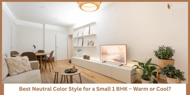
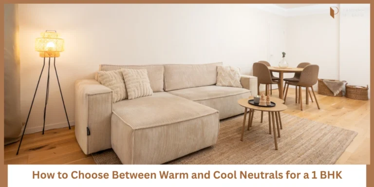
Warm Neutrals Make Compact Homes Feel Softer and More Inviting
Warm neutral apartments usually feel:
- cozier
- calmer
- emotionally softer
They pair naturally with:
- wooden furniture
- warm lighting
- earthy textures
That’s why cozy small apartment interiors often use beige, warm whites, and greige tones.
Warm palettes also create smoother visual flow in compact homes.
Cool Neutrals Create a Cleaner and More Minimal Look
Cool neutral apartments feel:
- sharper
- cleaner
- more modern
They work beautifully with:
- minimalist furniture
- glass finishes
- black accents
- modern styling
Modern minimalist interiors often prefer cooler palettes because they create stronger contrast and cleaner lines.
Warm Neutrals Usually Work Better in Indian Homes
Most Indian homes naturally use:
- warm lighting
- wooden furniture
- earthy flooring
- beige tiles
That’s why warm lighting home design usually blends more naturally with warm neutrals.
These combinations also feel more forgiving in daily life.
Cool Neutrals Work Better in Homes with Strong Natural Light
Cool grey interiors work especially well in:
- bright apartments
- homes with large windows
- glass-heavy layouts
Natural daylight balances cooler undertones properly and prevents the home from feeling dull.
Warm Neutrals Hide Visual Clutter More Easily
Warm colours soften transitions naturally.
This makes:
- furniture blending
- storage integration
- texture layering
…feel smoother visually.
That’s why clutter friendly interiors often lean toward warmer palettes.
Cool Neutrals Need Better Styling Balance
Cool neutrals can sometimes feel cold if not balanced properly.
They usually need:
- warmer fabrics
- textured layering
- wood accents
- softer lighting
Balanced grey interiors work best when warmth is added carefully.
Warm vs Cool Neutral Comparison
| Factor | Warm Neutrals | Cool Neutrals |
|---|---|---|
| Atmosphere | Cozy & relaxed | Clean & modern |
| Spaciousness | Soft openness | Sharper spaciousness |
| Lighting Compatibility | Better with warm lights | Better with natural daylight |
| Styling Feel | Warm minimalism | Modern minimalism |
| Furniture Pairing | Wood & earthy textures | Black, glass & sleek finishes |
| Maintenance Appearance | More forgiving | Shows contrast more |
| Visual Warmth | Higher | Lower |
| Best For | Comfortable family homes | Contemporary modern styling |
Best Warm Neutral Colour Ideas for a 1 BHK
Warm palettes work beautifully in compact Indian homes.
Warm White for Timeless Spaciousness
Warm white apartment walls create:
- brightness
- softness
- openness
They also feel less harsh than pure white interiors.
Beige for Cozy Minimalism
Beige apartment interiors feel:
- warm
- welcoming
- relaxed
This works especially well with wooden furniture and textured fabrics.
Greige for Balanced Modern Styling
Greige apartment walls combine:
- beige warmth
- grey sophistication
This creates balanced modern warm interiors that feel elegant without becoming cold.
Sand and Taupe for Earthy Sophistication
Taupe wall colours add:
- depth
- richness
- earthy calmness
These shades work beautifully in elegant compact apartments.
Best Cool Neutral Colour Ideas for a 1 BHK
Cool palettes work best when balanced thoughtfully.
Soft Grey for Modern Apartments
Soft grey apartment walls create:
- contemporary styling
- clean visual flow
- elegant simplicity
Ash White for Cleaner Visual Styling
Ash white interiors feel:
- minimal
- bright
- airy
They work especially well in naturally bright homes.
Blue-Grey for Calm Contemporary Spaces
Blue grey apartment walls create:
- softness
- calmness
- modern elegance
This works beautifully in modern compact interiors.
Charcoal Accents for Sophisticated Contrast
Dark neutral apartment accents like charcoal:
- add depth
- improve contrast
- create sophistication
But they should remain limited in compact homes.
NEUTRAL COLOUR GUIDE
Free Neutral Colour Palette Guide for Small Flats
Includes:
- Warm and cool neutral combinations
- Undertone matching guide
- Lighting coordination ideas
- Furniture pairing recommendations
Which Neutral Palette Makes a Small Room Look Bigger?
The answer depends more on balance than colour alone.
Lighter Warm Neutrals Reflect Light More Softly
Warm neutrals create gentle spaciousness without feeling harsh.
Cool Neutrals Can Feel Spacious but Sometimes Colder
Cool tones improve visual sharpness but may feel emotionally colder in low-light homes.
Monochromatic Colour Flow Improves Continuity
Using similar shades across walls, ceilings, and furniture reduces visual breaks.
Ceiling and Wall Coordination Matters
Strong ceiling contrasts often reduce spaciousness visually.
Matte Finishes Feel Softer
Matte textures reduce glare and improve comfort visually.
Texture Balance Matters More Than Colour Alone
Even neutral homes feel richer when:
- fabrics
- wood textures
- lighting
- layering
…are balanced properly.
Common Neutral Colour Mistakes in Compact Flats
Many homeowners follow trends without considering their actual home conditions.
Common neutral colour mistakes include:
- choosing grey without enough daylight
- mixing undertones randomly
- using harsh white lighting
- ignoring flooring coordination
- making every room a different neutral shade
The best neutral interiors usually feel calm, connected, and layered instead of overly styled.
How to Choose the Right Neutral Palette for Your Lifestyle
Your lifestyle matters more than trends.
Choose Warm Neutrals If You Prefer Cozy Spaces
Warm palettes feel:
- softer
- relaxed
- more welcoming
Choose Cool Neutrals If You Like Minimal Styling
Cool palettes work well for:
- modern apartments
- sharp aesthetics
- cleaner visual contrast
Mix Both Carefully for Balance
Warm wood textures with cool grey walls can work beautifully when balanced correctly.
Prioritize Lighting Before Finalizing Colours
Always test paint shades under:
- daytime light
- evening lighting
- warm artificial lighting
Test Samples at Different Times of Day
The same colour can look completely different morning versus night.
FREE 3D PALETTE VISUALIZATION
Get a Free 3D Neutral Palette Visualization for Your 1 BHK
Includes:
- Room-wise colour previews
- Undertone matching suggestions
- Lighting coordination ideas
- Furniture finish recommendations
Final Thoughts — The Best Neutral Palette Is the One That Matches Your Lifestyle and Lighting
Both warm neutrals and cool neutrals can work beautifully in a 1 BHK.
The key difference is how they make your home feel daily.
Warm neutrals usually create:
- comfort
- softness
- relaxed elegance
Cool neutrals create:
- sharper minimalism
- cleaner styling
- contemporary atmosphere
But lighting, textures, flooring, and furniture influence the final result heavily.
The best neutral interiors quietly make compact homes feel calmer, brighter, and easier to enjoy every day.
COLOUR COORDINATION CHECKLIST
Free Finish and Colour Coordination Checklist
Includes:
- Undertone matching guide
- Wall and flooring coordination sheet
- Lighting compatibility checklist
- Room-wise palette planner
Frequently Asked Questions
Warm whites, greige, beige, soft grey, and taupe usually work very well in compact homes.
Warm neutrals generally feel more forgiving and cozy in Indian homes, but cool neutrals work beautifully with strong natural lighting.
They can if lighting and textures are not balanced properly. Warm lighting and soft fabrics help reduce coldness.
Lighter neutral shades with minimal contrast usually improve spaciousness visually.
Yes. Warm woods, soft greys, and balanced lighting can create beautiful layered interiors when coordinated carefully.