In a compact apartment, paint colours do much more than improve appearance.
They affect:
- brightness
- spaciousness
- mood
- comfort
- even how expensive the home feels
Many homeowners underestimate how strongly colours influence a 1 BHK interior. A shade that looks beautiful on social media can sometimes make a real apartment feel:
- darker
- tighter
- colder
- visually heavy
Especially in Mumbai flats where natural light changes throughout the day.
The good news is that the right paint colours for small flats can completely transform how the home feels daily.
Modern small home interior trends now focus more on:
- warmth
- softness
- calming neutrals
- balanced colour palettes
Because in a 1 BHK, colour is not just decoration — it changes how spacious the home feels.
Why Paint Colours Matter More in a Small 1 BHK
Compact homes react strongly to colour decisions.
Colours Directly Affect Spaciousness
Lighter shades improve:
- light reflection
- visual openness
- ceiling height perception
- room continuity
That’s why most small apartment colour ideas focus on softer palettes instead of strong contrasts.
The Wrong Colours Can Make Compact Flats Feel Smaller
Some common small home interior mistakes include:
- excessive dark colours
- harsh black-and-white contrasts
- poor lighting coordination
- visually heavy feature walls
These dark colour apartment issues often make rooms feel tighter than they actually are.
Good Colour Planning Improves Mood and Comfort
Calming home colours create:
- softer visual atmosphere
- better relaxation
- smoother room flow
Warm neutrals and balanced tones usually make compact homes feel easier to live in daily.
FREE CONSULTATION
Free Colour Consultation for Your 1 BHK
What you’ll get:
- Room-wise colour suggestions
- Lighting coordination advice
- Furniture matching guidance
- Spaciousness-focused palette recommendations

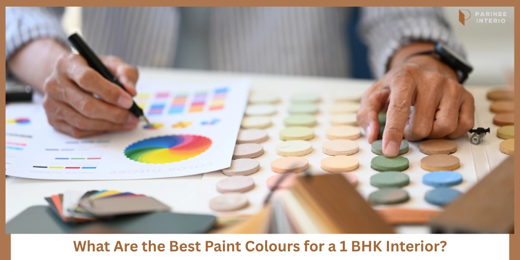
Best Paint Colours for Small 1 BHK Flats
Some colours naturally work better in compact apartments because they improve openness without feeling boring.
Warm White — The Safest Choice for Spaciousness
Warm white interiors remain one of the safest options for small flats because they:
- reflect light beautifully
- create openness
- match almost every furniture style
They pair especially well with:
- oak wood finishes
- beige fabrics
- matte black accents
Unlike harsh pure white, warmer whites feel softer and more comfortable.
Soft Beige for Warm Minimalism
Beige apartment interiors create:
- cozy atmosphere
- balanced warmth
- timeless elegance
Warm neutral paint colours also hide visual imperfections more softly compared to cooler shades.
This works beautifully in Indian homes with warm lighting.
Light Greys for Modern Compact Homes
Grey wall colours for apartment interiors create:
- subtle sophistication
- clean aesthetics
- balanced minimal styling
Lighter greys work best because darker greys can sometimes feel heavy in low-light apartments.
Sage Green for Calm and Freshness
Sage green interiors have become very popular because they feel:
- calming
- fresh
- natural
Soft green apartment walls also pair beautifully with:
- indoor plants
- wooden furniture
- warm lighting
This colour works especially well for bedrooms and kitchens.
Greige (Grey + Beige) for Contemporary Flats
Greige wall colours balance:
- warmth
- modern styling
- softness
This is one of the most versatile modern neutral interiors because it adapts well to both warm and cool furniture tones.
Dusty Blue for Subtle Accent Styling
Soft blue interiors work beautifully as:
- bedroom accent walls
- reading corners
- calm background shades
Dusty blue creates visual calmness without overpowering compact rooms.
Terracotta and Earthy Tones Used Carefully
Earthy apartment colours add warmth and personality when used subtly.
Terracotta accent walls work best:
- behind dining areas
- in small sections
- paired with lighter neutrals
Overusing earthy tones can sometimes make compact spaces feel visually heavy.
Which Colours Make a Small Room Look Bigger?
Many homeowners search for one “perfect colour,” but spaciousness actually comes from overall balance.
Warm Whites Reflect More Natural Light
Warm whites brighten rooms softly without creating harsh glare.
Monochromatic Colour Schemes Improve Visual Flow
Using similar tones across walls and furniture improves continuity.
Soft Neutral Shades Reduce Visual Clutter
Strong colour breaks make compact homes feel more segmented.
Similar Wall and Ceiling Colours Increase Height Perception
Heavy ceiling contrast can visually reduce room height.
Matte Finishes Feel Softer and More Spacious
Matte walls create smoother visual depth compared to glossy reflections.
Consistent Colours Across Rooms Improve Continuity
Spacious apartment colour ideas usually maintain a connected colour story across the entire flat.
COLOUR PALETTE GUIDE
Free 1 BHK Colour Palette Guide
Includes:
- Room-wise colour combinations
- Wall and furniture matching guide
- Lighting coordination ideas
- Paint finish recommendations
Best Paint Colour Combinations for Different Rooms in a 1 BHK
Different rooms need slightly different emotional atmospheres.
Living Room Colour Ideas
Good apartment wall colour combinations include:
- warm white + beige
- greige + oak wood
- soft grey + textured fabrics
These combinations improve both elegance and spaciousness.
Bedroom Colour Ideas
Relaxing bedroom colours usually include:
- muted beige
- sage green
- dusty blue
- warm greys
Bedrooms should feel calming instead of visually stimulating.
Kitchen Colour Ideas
Modern modular kitchen colour ideas often use:
- white and wood combinations
- sage green lower cabinets
- soft beige walls
Brighter small kitchen paint colours improve cleanliness visually.
Bathroom Colour Ideas
Compact bathroom interiors usually benefit from:
- light tiles
- warm neutrals
- reflective surfaces
This helps smaller bathrooms feel brighter and cleaner.
Can Dark Colours Work in a 1 BHK?
Yes — but carefully.
Dark Colours Work Better as Accents
Dark accent walls usually work better than fully dark rooms.
Small accents create depth without reducing openness heavily.
Lighting Quality Matters More with Dark Shades
Layered lighting apartment designs become extremely important when darker colours are used.
Without proper lighting, dark walls can feel dull.
Balance Dark Colours with Warm Neutrals
Modern luxury apartment colours often combine:
- charcoal accents
- beige walls
- wooden textures
- warm lighting
This keeps the home balanced.
Matte Dark Finishes Feel Softer
Matte wall paint usually looks more sophisticated than glossy dark surfaces.
Glossy dark finishes often create excessive reflections in compact homes.
Common Paint Colour Mistakes in Small Flats
Many homeowners regret colour choices later because planning happens too quickly.
Common small apartment colour mistakes include:
- using too many colours across rooms
- choosing paint without checking natural light
- blindly following social media trends
- ignoring furniture and flooring coordination
- overusing dark shades
- mixing warm and cool undertones randomly
The best small-home colour palettes quietly create continuity, softness, and visual breathing space.
FREE 3D COLOUR VISUALIZATION
Get a Free 3D Colour Visualization for Your 1 BHK
Includes:
- Room-wise colour previews
- Lighting coordination suggestions
- Furniture matching guidance
- Accent wall recommendations
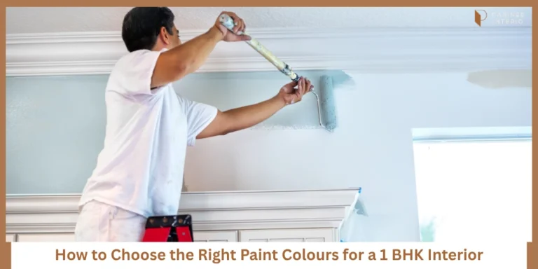
Paint Finish Types That Work Best in Small Flats
Paint finish matters almost as much as colour.
Matte Finish for Softer Elegant Walls
Matte finishes:
- reduce glare
- feel premium
- create softer walls visually
Eggshell Finish for Easier Cleaning
Eggshell finishes offer:
- slight sheen
- better durability
- easier maintenance
This works well for living rooms and bedrooms.
Satin Finish for Kitchens and Bathrooms
Satin finishes resist moisture better and clean more easily.
Avoid Excessive Gloss in Compact Homes
Too much gloss can create visual harshness and excessive reflections.
That’s why the best paint finish for apartment interiors usually stays subtle.
Final Thoughts — The Right Paint Colours Can Completely Change How a 1 BHK Feels
The best paint colours for a 1 bhk interior are not always the trendiest ones.
The right colours are the ones that:
- improve spaciousness
- feel calming daily
- coordinate naturally with lighting
- create visual continuity
In compact flats, balanced palettes matter much more than dramatic styling.
Because the best colour combinations quietly make homes feel brighter, calmer, and easier to enjoy every day.
PAINT SELECTION CHECKLIST
Free Paint Finish and Colour Selection Checklist
Includes:
- Paint finish comparison guide
- Undertone matching sheet
- Room-wise colour planner
- Lighting coordination checklist
Frequently Asked Questions
Warm whites, soft beige, greige, light grey, and muted neutral shades usually improve spaciousness visually.
Dark colours can work as accents, but excessive dark shades may make compact flats feel smaller without proper lighting balance.
Matte and eggshell finishes usually work best because they feel softer and more elegant.
Warm whites, sage green, greige, soft beige, and light greys are among the most popular modern small-home colours.
Focus on:
- natural lighting
- flooring tones
- furniture finishes
- overall continuity
Using connected neutral palettes usually works best for compact homes.