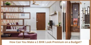
You don’t need more space to make your bedroom feel bigger.
You need the right colors.
A lot of 1 BHK bedrooms feel:
- Smaller than they actually are
- Slightly heavy
- Not very relaxing
And the reason is often simple:
- Dark wall shades
- Too much contrast
- Poor color combinations
Here’s the shift you need:
Color affects how your space looks and how it feels.
The same room can feel:
- Spacious or tight
- Calm or stressful
…just based on color.
In this guide, we’ll look at combinations that actually work—not just look good in photos.
How Colors Affect Space and Mood in a Small Bedroom
Before choosing colors, understand what they do.
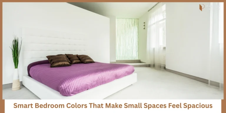
Light Colors → Spacious Feel
Light tones reflect more light.
This makes your room:
- Brighter
- Airier
- Visually larger
That’s why most small-space designs use lighter palettes.
Dark Colors → Heavier Feel
Dark tones absorb light.
This can make the room:
- Feel smaller
- Look more enclosed
- Slightly overwhelming
Not always bad—but risky in small bedrooms.
Soft Tones → Calm Mood
Bedrooms are for rest.
Soft colors:
- Reduce visual stress
- Create a relaxed atmosphere
- Help you unwind
Simple insight:
Color is one of the easiest ways to control both space and emotion.
Plan Your Bedroom Layout Before Finalizing Colors
Most people choose color first.
Then they adjust everything else around it.
That’s a mistake.
Because color works best when aligned with:
- Bed placement
- Wardrobe size
- Natural light direction
Without layout clarity:
- Colors may look different than expected
- The room may still feel cramped
- Light won’t reflect properly
Bedroom Layout Guide (Helps you plan bed placement, wardrobe position, and lighting before choosing colors)
10 Bedroom Color Ideas That Make Your 1 BHK Feel Bigger and Calmer
Now let’s get into combinations that actually work in real homes.
These are practical, not just aesthetic.
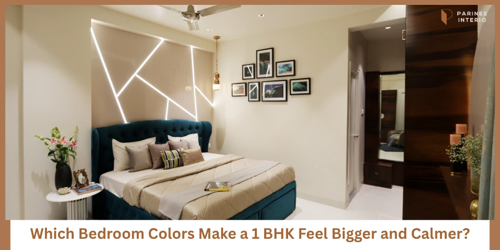
1. Soft White + Warm Beige
Best For: Clean and airy feel
- White keeps the room open
- Beige adds warmth
This combination feels light but not cold.
2. Light Grey + White
Best For: Modern calm look
- Grey adds subtle depth
- White keeps it balanced
Works well with minimal furniture.
3. Pastel Blue + White
Best For: Relaxing atmosphere
- Blue creates calm
- White enhances brightness
Great for reducing visual stress.
4. Light Green + Neutral Tones
Best For: Fresh and natural feel
- Green brings a fresh vibe
- Neutrals keep it grounded
Ideal if you want a peaceful environment.
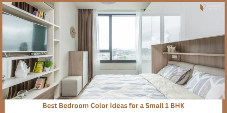
5. Cream + Wooden Accents
Best For: Warm comfort
- Cream softens the space
- Wood adds warmth
Feels cozy without being heavy.
6. Off-White + Soft Pink
Best For: Soft elegance
- Pink adds subtle warmth
- Off-white keeps it light
Good for a soft, welcoming look.
7. Beige + Light Brown
Best For: Cozy minimal
- Works well with wooden furniture
- Keeps everything cohesive
Best for a grounded, natural feel.
8. White + Mirror Accents
Best For: Maximum openness
- White expands space
- Mirrors reflect light
Together, they create a very open feel.
9. Light Taupe + White
Best For: Subtle depth
- Taupe adds character
- White maintains brightness
Good if you want variation without heaviness.
10. Monochrome Light Palette
Best For: Seamless look
- Same color family
- Slight variations
Creates flow and continuity.
Key takeaway:
Consistency in color creates a sense of flow—and that’s what makes spaces feel bigger.
Use This Bedroom Storage Checklist Before Finalizing Your Design
Even the best color won’t help if your room feels cluttered.
Because clutter:
- Breaks visual flow
- Reduces openness
- Makes colors look heavy
Before finalizing:
- Check storage needs
- Reduce visible clutter
- Plan hidden storage
Bedroom Storage Checklist (Helps you reduce clutter and plan storage so your room stays open and calm)
Colors to Avoid in a Small Bedroom (If You Want It to Feel Bigger)
Some colors can work—but only in specific conditions.
Otherwise, they create problems.
Dark Shades
- Absorb light
- Make space feel tight
Heavy Contrasts
- Too many color breaks
- No visual flow
Over-Patterned Walls
- Busy visuals
- Feels cluttered
Simple rule:
If the wall draws too much attention, the room feels smaller.
How to Choose the Right Color for Your Bedroom
Don’t choose randomly.
Base your decision on your actual space.
Based on Light
Less natural light → go lighter
More natural light → slight flexibility
Based on Room Size
Smaller room → lighter palette
Slightly bigger → can add depth
Based on Furniture
Dark furniture → lighter walls
Light furniture → balanced tones
Everything should work together.
How Color Works with Furniture and Lighting
Color doesn’t work alone.
It interacts with everything.
Light Furniture + Light Walls
Creates:
- Seamless look
- Open feel
- Clean space
Balanced Lighting
Use:
- Warm lighting for comfort
- Even distribution
Avoid harsh lighting—it affects color perception.
Avoid Contrast Overload
Too many differences:
- Break visual flow
- Make space feel smaller
Keep it simple.
Conclusion: The Right Colors Make Your Bedroom Feel Effortless
You don’t need bigger rooms.
You need smarter choices.
Color is one of the simplest ways to:
- Make your space feel larger
- Improve comfort
- Create a calm environment
When chosen right, everything feels easier.
Create a Bedroom That Feels Bigger and Calmer
If you’re unsure which colors will actually work in your room, don’t guess.
Because color decisions affect your daily comfort.
We’ll help you:
- Choose the right palette
- Align it with your layout
- Create a balanced design
Personalized Bedroom Color + Layout Plan (Get expert recommendations based on your room size, light, and furniture setup)